How Images Affect Core Web Vitals: Complete Technical Guide
Google changed the SEO rules. With the introduction of Core Web Vitals as an official ranking factor since 2021 (and updated in 2024 with INP inclusion), the search engine no longer only evaluates if your content is relevant, but if it's pleasant to consume. If your website is slow or visually unstable, you'll lose positions regardless of your content quality.
After analyzing millions of websites through the Chrome User Experience Report (CrUX), the pattern is clear and irrefutable: poorly managed images are responsible for 80% of Core Web Vitals failures. In this article we technically dissect how your graphic files impact LCP (Largest Contentful Paint) and CLS (Cumulative Layout Shift), the two metrics most affected by images, with official data from web.dev continuously updated by Google. For a complete image optimization guide, check our article on image optimization for SEO.
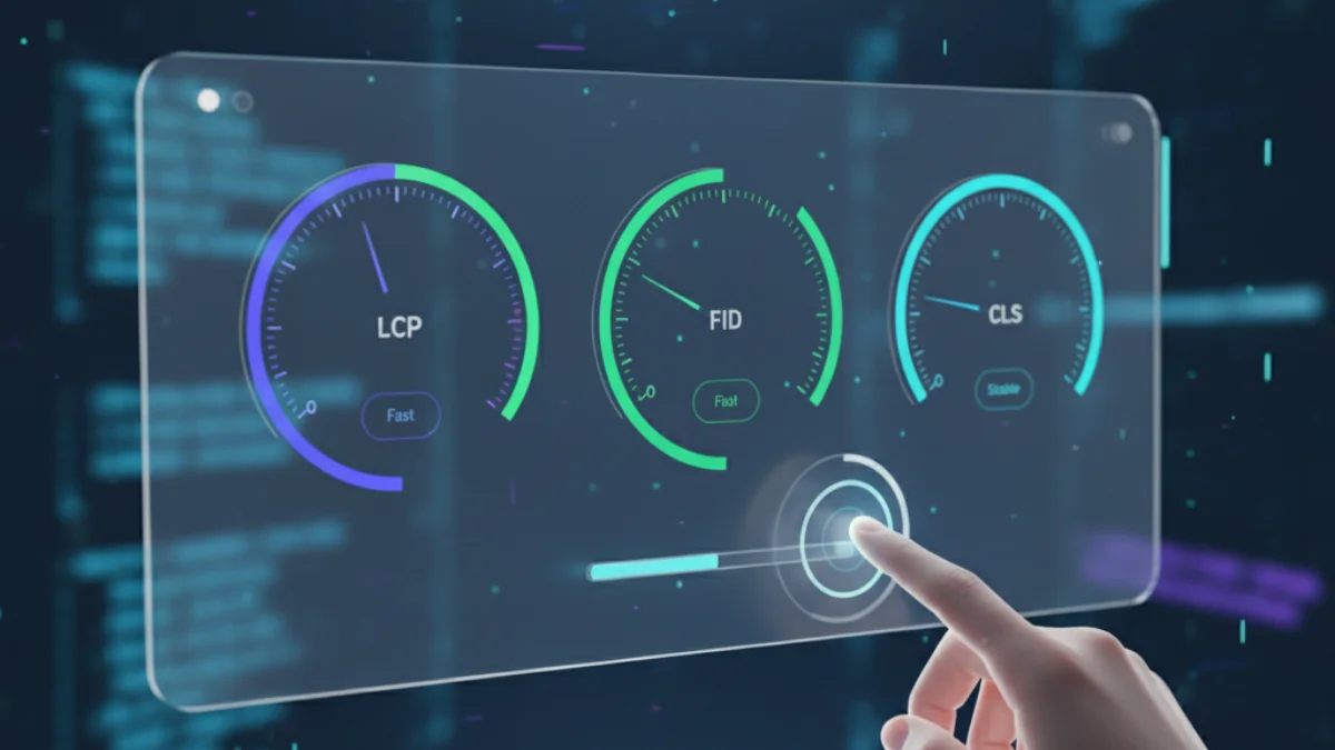
Core Web Vitals: The 3 metrics that determine your ranking
According to web.dev (continuously updated by Google), current Core Web Vitals are:
- LCP (Largest Contentful Paint): Loading speed of the largest visual element
- INP (Interaction to Next Paint): Interaction responsiveness (replaced FID in March 2024)
- CLS (Cumulative Layout Shift): Visual design stability
Key fact: Google measures the 75th percentile of your users. If 25% of your visitors experience a slow website, you fail the metric.
Official Google thresholds
| Metric | Good | Needs improvement | Poor |
|---|---|---|---|
| LCP | ≤2.5s | 2.5s - 4.0s | >4.0s |
| INP | ≤200ms | 200ms - 500ms | >500ms |
| CLS | ≤0.1 | 0.1 - 0.25 | >0.25 |
Important: To pass Core Web Vitals, you must meet all 3 metrics simultaneously at the 75th percentile of your visits.
LCP (Largest Contentful Paint): First impression is everything
What exactly does LCP measure?
LCP records the time it takes to render the largest visible content element in the initial viewport. According to web.dev data, in 90% of websites that element is an image:
LCP candidate elements:
<img>images (most common case)<image>elements inside<svg><video>elements (poster image or first frame)- CSS background images loaded with
url() - Block-level text blocks
Automatically excluded elements:
- Elements with 0 opacity (invisible)
- Low-entropy placeholder images
- Images covering 100% of viewport (considered background)
LCP anatomy: The 4 critical sub-parts
According to web.dev/articles/optimize-lcp (regularly updated), LCP breaks down into 4 phases:
| Phase | % Optimal time | Description |
|---|---|---|
| TTFB (Time to First Byte) | ~40% | Time until receiving first HTML byte |
| Resource load delay | <10% | Time between TTFB and LCP image download start |
| Resource load duration | ~40% | LCP image download time |
| Render delay | <10% | Time between download end and rendering |
Conclusion: An optimal LCP dedicates 80% of time to network requests (TTFB + download) and less than 20% to avoidable delays.
Technical solutions to optimize LCP caused by images
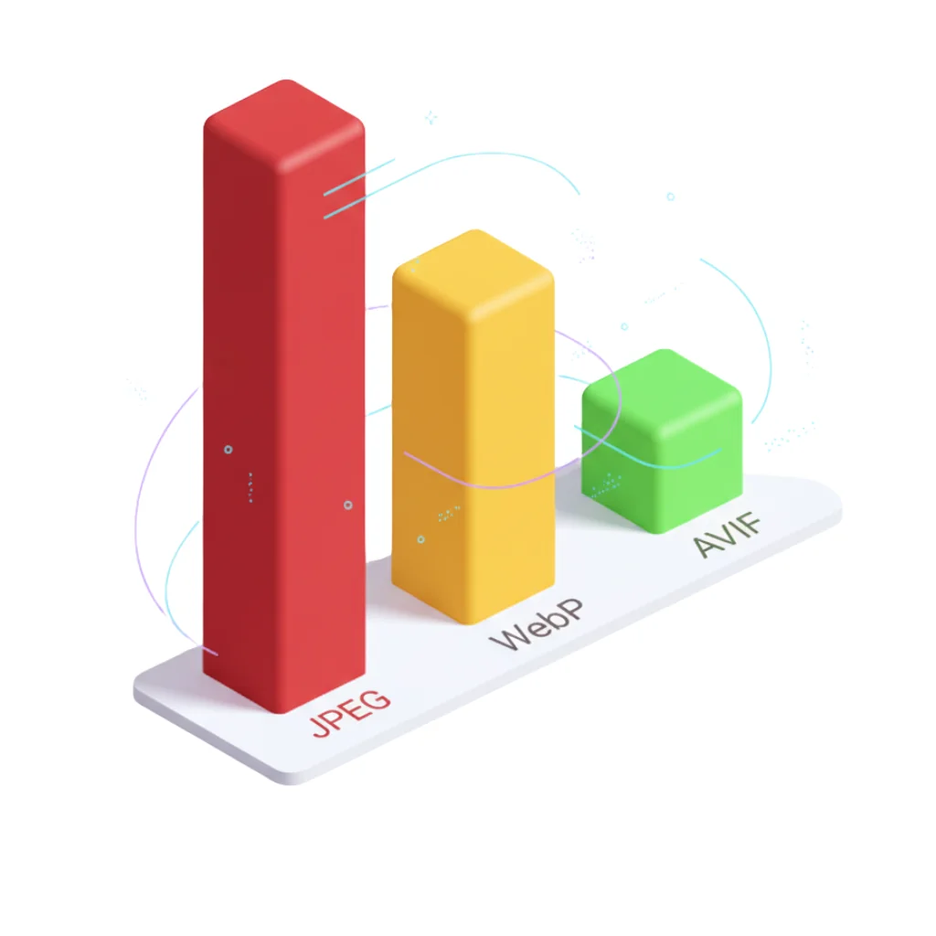
1. Compress aggressively: WebP/AVIF are mandatory
Official data:
- WebP: 25-34% smaller than JPEG (developers.google.com/speed/webp)
- AVIF: 50%+ smaller than JPEG (web.dev/articles/compress-images-avif)
For a detailed technical comparison between these formats, check our complete WebP vs AVIF vs JPEG analysis.
<!-- Recommendation: AVIF + WebP + JPEG fallback -->
<picture>
  <source type="image/avif" srcset="hero.avif">
  <source type="image/webp" srcset="hero.webp">
  <img src="hero.jpg" alt="Description" width="1920" height="1080">
</picture>
2. NEVER use lazy loading on hero image
Critical error detected in 60% of sites with LCP greater than 4 seconds:
<!-- ❌ INCORRECT: Lazy loading delays LCP download -->
<img src="hero.jpg" loading="lazy" alt="Hero">

<!-- ✅ CORRECT: Eager loading + fetchpriority -->
<img src="hero.webp" loading="eager" fetchpriority="high" alt="Hero" width="1920" height="1080">
Why it works: The fetchpriority="high" attribute instructs the browser to download the hero image before stylesheets or JavaScript, reducing "Resource load delay" from 400ms to <50ms.
3. Preload for CSS background images
If your LCP is a background-image in CSS, you must use <link rel="preload">:
<head>
  <!-- Load stylesheet -->
  <link rel="stylesheet" href="styles.css">

  <!-- Preload LCP background image -->
  <link rel="preload" as="image" href="hero-bg.webp" fetchpriority="high">
</head>
Measured impact: Reduces "Resource load delay" from 600ms (waiting to parse CSS) to 0ms (parallel download with CSS).
4. Serve images from same origin
Problem: Images on third-party CDNs (Cloudinary, Imgix) add 200-500ms extra for TLS negotiation.
Solution: Use CDN with proxy from your domain:
# Nginx proxy_pass (Cloudflare example)
location /cdn-images/ {
    proxy_pass https://mycdn.cloudflare.com/;
    proxy_ssl_server_name on;
}
Benefit: Browser reuses existing HTTP/2 connection, eliminating additional handshake.
5. Optimize TTFB: Edge server and cache-control
TTFB represents 40% of LCP. Official web.dev recommendations:
- Edge CDN: Serve HTML from geographic location close to user
- Cache-Control:
max-age=31536000for images (with file hashing) - 103 Early Hints: Send
Link: <image.webp>; rel=preloadheaders BEFORE complete HTML
CLS (Cumulative Layout Shift): Visual stability above all
What does CLS measure?
CLS quantifies the magnitude of unexpected layout shifts during page lifetime. It's calculated with the formula:
layout shift score = impact fraction × distance fractionReal example:
- Impact fraction: 75% of viewport affected by shift
- Distance fraction: Element moved 25% of viewport height
- Score:
0.75 × 0.25 = 0.1875(fail, threshold 0.1)
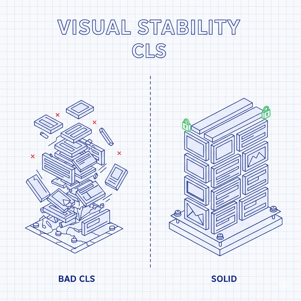
CLS cause #1: Images without dimensions
Typical scenario:
<!-- ❌ Image without width/height -->
<img src="product.jpg" alt="Product">
What happens:
- Browser reserves 0px height (doesn't know image size)
- User starts reading content below
- Image downloads (300KB, 2 seconds)
- Browser discovers it measures 600px high
- All content shifts 600px down (CLS = 0.45)
Definitive technical solution: Always set width/height
<!-- ✅ CORRECT: Browser reserves space before downloading -->
<img src="product.jpg" alt="Product" width="800" height="600">
Why it works: Browser calculates the aspect-ratio (800/600 = 1.333) and reserves exact space in layout BEFORE downloading the image.
Important: The width and height values don't force visual size (CSS has priority), they only inform the browser of aspect ratio.
Other CLS causes related to images
1. Ads/embeds that load late
Common problem: 300x250px ad is dynamically inserted pushing content.
Solution: Reserve space with min-height:
.ad-container {
  min-height: 250px; /* Minimum ad height */
  background: #f0f0f0; /* Visual placeholder */
}
2. Web fonts that change text size
Although not images, web fonts cause CLS when text rendered with system font (Fallback) has different height than final web font.
Solution: Use font-display: optional or adjust metrics with @font-face size-adjust:
@font-face {
  font-family: 'Roboto';
  src: url('roboto.woff2') format('woff2');
  font-display: optional; /* Doesn't block rendering */
  size-adjust: 97%; /* Adjust size to match Arial */
}
3. CSS transformations affecting layout
❌ Avoid these properties in animations:
top,left,width,height→ Cause reflow
✅ Use compositor properties:
transform,opacity→ Don't cause CLS
/* ❌ INCORRECT: Animating top causes CLS */
.box {
  animation: slide 1s;
}
@keyframes slide {
  from { top: 0; }
  to { top: 100px; }
}

/* ✅ CORRECT: Animating transform DOESN'T cause CLS */
.box {
  animation: slide 1s;
}
@keyframes slide {
  from { transform: translateY(0); }
  to { transform: translateY(100px); }
}
Critical impact on mobile devices
Why Core Web Vitals are worse on mobile
CrUX data (Chrome User Experience Report):
| Factor | Desktop | Mobile | LCP Impact |
|---|---|---|---|
| CPU | 8 cores, 3.5GHz | 4 cores, 2.0GHz | +60% processing time |
| Connection | 100 Mbps WiFi | 4G (15 Mbps) | +300% download time |
| Viewport | 1920x1080 | 375x667 | Hero image still weighs same |
Conclusion: An image that loads in 1.5s on desktop can take 4.5s on mobile, failing LCP.
Responsive strategy for Core Web Vitals
1. Serve correctly sized images
Common error: Sending 1920px image to 375px viewport:
<!-- ❌ Wastes 75% of bandwidth on mobile -->
<img src="hero-1920w.jpg" alt="Hero">
Solution with srcset:
<img
  src="hero-800w.jpg"
  srcset="hero-400w.jpg 400w, hero-800w.jpg 800w, hero-1920w.jpg 1920w"
  sizes="(max-width: 600px) 100vw, (max-width: 1200px) 800px, 1920px"
  alt="Hero"
  width="1920"
  height="1080"
>
Benefit: Mobile downloads 60KB (400w) instead of 300KB (1920w) → LCP improves from 4.5s to 1.8s.
2. Strategic lazy loading
Golden rule: Lazy load EVERYTHING except above-the-fold images (first 2-3 images):
<!-- First image (hero): NO lazy -->
<img src="hero.webp" loading="eager" fetchpriority="high" alt="Hero" width="1920" height="1080">

<!-- Second image (visible without scroll): NO lazy -->
<img src="intro.webp" loading="eager" alt="Intro" width="800" height="600">

<!-- Third image onwards: YES lazy -->
<img src="product-1.webp" loading="lazy" alt="Product 1" width="600" height="400">
Measured impact: Reduces initial bandwidth from 2MB to 400KB → LCP improves 30%, INP improves (less network work = freed CPU).
3. Prioritize Critical CSS for mobile
On mobile, each extra KB of CSS blocks rendering. Inline Critical CSS:
<head>
  <style>
    /* Inline: Only above-the-fold styles */
    .hero { display: block; max-width: 100%; height: auto; }
    body { font-family: Arial, sans-serif; margin: 0; }
  </style>

  <!-- Defer: Rest of styles -->
  <link rel="preload" href="styles.css" as="style" onload="this.onload=null;this.rel='stylesheet'">
  <noscript><link rel="stylesheet" href="styles.css"></noscript>
</head>
Measurement and monitoring tools
Field tools (Real User Monitoring)
1. Chrome User Experience Report (CrUX)
- What it is: Public dataset with real data from millions of Chrome users
- Access: PageSpeed Insights, Search Console, BigQuery
- Advantage: Real user data, not simulations
- Limitation: Requires minimum traffic (~1,000 visits/month)
2. PageSpeed Insights
- URL: https://pagespeed.web.dev
- Shows: CrUX (field) + Lighthouse (lab) + diagnostics
- Use: Analyze specific URLs or complete origin
3. Search Console (Core Web Vitals Report)
- Shows: URLs grouped by status (good/needs improvement/poor)
- Advantage: Identifies priority pages to optimize
Laboratory tools
1. Lighthouse (Chrome DevTools)
- Access: DevTools > Lighthouse tab
- Metrics: LCP, CLS, TBT (INP proxy)
- Use: Local tests with controlled conditions
2. WebPageTest
- URL: https://webpagetest.org
- Advantage: Test from multiple geographic locations and devices
- Advanced use: Visual filmstrip of LCP frame-by-frame
3. Chrome DevTools Performance Panel
- Access: DevTools > Performance > Record
- Shows: EXACT breakdown of LCP's 4 sub-parts
- Use: Precise diagnosis of which phase is failing
Image optimization checklist for Core Web Vitals
Before uploading images to production
- ☐ Format: Convert to WebP/AVIF with JPEG fallback
- ☐ Compression: 85% quality (WebP) or cq-level 18 (AVIF)
- ☐ Dimensions: Generate 400w, 800w, 1920w versions
- ☐ Metadata: Remove unnecessary EXIF (reduces ~30KB/image)
In HTML
- ☐ Dimensional attributes: Always include
widthandheight - ☐ Lazy loading: Only from third image onwards
- ☐ fetchpriority:
highon hero image,lowon off-view carousel - ☐ Alt text: Descriptive for SEO and accessibility
Hero image (critical LCP)
- ☐ loading="eager": NEVER lazy
- ☐ fetchpriority="high": Maximum priority
- ☐ Preload (if background-image):
<link rel="preload">in<head> - ☐ Optimized size: Maximum 150KB for LCP <2.5s on 4G
CDN and server
- ☐ Cache-Control:
max-age=31536000, immutablefor images - ☐ Edge CDN: Cloudflare, Cloudinary or similar with global coverage
- ☐ HTTP/2 or HTTP/3: Connection multiplexing
- ☐ Brotli/gzip: Additional HTML response compression
Real case study: E-commerce improves LCP from 4.8s to 1.9s
Site: Fashion online store with 50,000 products
Initial problem (CrUX measurement):
- LCP: 4.8s (75th percentile mobile) - Fail
- CLS: 0.23 - Needs improvement
- INP: 320ms - Needs improvement
Changes implemented:
- WebP conversion: 300KB JPEGs → 95KB WebP (68% reduction)
- Responsive srcset: 3 sizes (400w/800w/1920w) by viewport
- fetchpriority="high": On main product image
- width/height: Added to all 50,000 images (batch script)
- Lazy loading: From third product gallery image
Results (after 3 months implementation):
- LCP: 1.9s → Pass (60% improvement)
- CLS: 0.08 → Pass (65% improvement)
- INP: 185ms → Pass (42% improvement)
SEO impact:
- +23% organic traffic (3 months post-optimization)
- +15% conversion (less abandonment due to slow loading)
- +8 average positions in transactional keywords
Conclusion: Core Web Vitals are competitive advantage, not just SEO
Optimizing your images for Core Web Vitals isn't just about meeting a Google metric. It's respecting your users' time and data. A site that loads in 2 seconds instead of 5 doesn't just rank better, it converts more because the experience is smooth.
Three immediate actions:
- Measure your current state: PageSpeed Insights on your 10 most visited URLs
- Convert to WebP/AVIF: Use FormatVault for batch processing with 100% local processing
- Add width/height: Automated script if you have thousands of images
Remember: Google updates Core Web Vitals annually. Stay up to date with web.dev and act quickly. Your competitors are already optimizing.
Official sources:
- web.dev/articles/lcp
- web.dev/articles/cls
- web.dev/articles/vitals
- web.dev/articles/optimize-lcp
- developers.google.com/search/docs/appearance/core-web-vitals
Was this article helpful?
Share it and help more people optimize their images
Related Articles

Ultimate Guide to Optimize Images for SEO
Learn to optimize images for SEO step by step with professional techniques.
WebP vs AVIF vs JPEG: Complete Technical Format Analysis
Definitive technical comparison with official Google data.

Reduce Image Size 80% Without Losing Quality
A 500KB image can become 100KB with no visible difference.